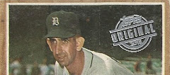
a lot of the 1969 and 1970 topps look that bad because of the four expansion teams, and then the pilots moving to milwaukee. 69 especially (since I built that set once upon a time) has a bunch like the butler...
Baseball cards have come a long way since then. Unfortunately, a lot of the 'improvements' don't do much for me. The use of logos is one improvement that is appreciated.
Random Wax: 2023 Topps Baseball Blaster
-
2023 Topps: Jose Ramirez is an excellent hitter that seems to fly under
the radar in Cleveland. He's a 5X All-Star and 4X Silver Slugger. He was
also to...
Not so common after all
-
Here's a card I finally welcomed into my collection after damn near (I kid
you not) a *decade *of searching.
One has big ideas for cards they've been wan...
Flea Market Finds #162: Some Nice Surprises
-
Clear skies and fresh air have a way of drawing people out of their homes.
That's why the De Anza Flea Market was packed two weekends ago. Not
exactly a ...
1966 Batman round two
-
*Picking right up where I left off yesterday with the Black Bat before
moving into the well you'll see.*
*Okay that finishes the Black Bat portion...
2022 SAGE Artistry
-
I picked up this mysterious pack out of a repack thing at Walgreen's the
other day. I'm mostly familiar with SAGE's "Hit" brand of cards, but
apparently ...
2024 Heritage – A Quick Look (Yeah, Right)
-
I know plenty of blogs and other online card resources have already shared
their 2024 Heritage cards, but I figured that I spent so much time looking
forwa...
Big Time
-
*A look at the new Topps Big League set. *
In the current production schedule, there aren't a lot of new baseball
cards to look at this early in the sea...
A *rare, and I missed it
-
Super quick post tonight...If you caught one of my recent posts, you might
remember that there was a decent table with most cards priced at 50 cents
or low...
KFC = Kentucky Fried Cards?
-
Now a couple of months ago, my brother and I drove out to KFC to get some
lunch. KFC is always good, but the parking lot was packed- they are in a
strip...
2024 National Hockey Card Day is This Saturday
-
Get Free Hockey Cards from Your Local Card Shop. Considering how hard it
has been to buy almost any recent hockey card products, the idea of
actually get...
Scoring from My Dealer
-
Another COMC haul. The shipping is a b*tch, but the inventory is huge.
Anyway, 80 cards this time. Let's look at a few.
- The Sue Bird is a sh...
Trading to completion: Part 1
-
Hello, happy trading card fans! It's been awhile, eh?
With a cross-country move, a new day job, and the other site taking up a
considerable amount of ti...
Trade Me Anything XVII #9
-
If there's one thing I can count on with this annual TMA event, it's
getting a trade package from Zpop in the springtime. Hey, we had snow when
this year'...
The card show comes to me
-
Saturday was a first for me, having not one but *two* fellow cardbloggers
hand-deliver boxes of cards to my door. How great is that?! First was Kevin
fro...
Oddball Mike Trout Slabbed Tickets
-
While I have not been collecting tickets with the same fervor I did a
couple of years ago, I still have plenty from that time period to scan in,
write up...
Franklin High Star Ron Santo
-
Fandom and it's associated collecting is a strange thing. When I first
became a Ron Santo fan I was young boy. Ron was in his prime, smashing
home runs...
Still Kicking
-
Figured it was time to throw something up here to stop the blog from being
sent to the abyss. I will say that I use the blog a lot more for research
pur...
2022 Topps Heritage Minor League Hobby Box
-
Looking for something cheap and new to open (this obviously is one of those
older unfinished posts), I chose 2022 Topps Heritage minor league. It was
$59.0...
Pandemic Pretender; or, Cards for Sale!
-
Hey everyone - well, yeah, it has been quite a few months since I last
spoke up in this space, and during that time I pretty much came to the
conclusion ...
Born in 1993 - Max Power
-
*You're watching the Simpsons with your daughter the other day...*
"Oh! I bet you'll like the Max Power episode." I said to my daughter.
"Let's see....
1991 Topps: the Desert Fox
-
I don't think Topps made a more iconic flagship set in the '90's than this
one. And it's not just the photography, although that did take a huge leap
for...
Five Months of Mail Roundup!
-
2021 and the start of 2022 has been busy for me and I've once again
neglected the blog. I've still been buying, selling, and collecting, and
I've got som...
A Thunderous New Addition, Pt. 2
-
Been a while since I checked in here. Life's been busy, lots of big life
changes, figuring out this whole parenthood thing, the Cubs have been a
whole b...
Closet Discoveries
-
I've been on a cleaning/reorganizing/purging binge lately and I attacked
my hobby closet earlier this week. I opened four boxes from the upper
shelves a...
Recent pickups
-
Look - if I don't get something posted soon, I will never do it. I spent
the past two days organizing my desk, and sorting out more mailings I need
to g...
Top 30 NHL Players of All-time: #27
-
So what you don't know is this is round 2 of this post. As a flash back to
the early days of this blog, Blogger decided to vomit out my post when I
hit pub...
Nick’s Super Stuffed PWE of Super Stuff
-
It seems like Thursday is becoming my regular posting day. I hadn’t really
intended it to be that way but with work being incredibly busy right now,
it’s...
The End of the 7 Day Trading Card Challenge Road
-
Here I am, I've come to the end of the line for my 7 Day Trading Card
Challenge. There have been twists and turns...planned and unplanned pauses,
but the j...
Back, With Buybacks
-
It's been awhile, so who knows if anyone will even see this. I'd been
posting everything on my other site, Bean's Ballcard Blog, for awhile.
Then there w...
PWEs, Accompanied by Song
-
I decided to write a post tonight comprised of recent PWEs that I've
received in the mail lately accompanied by songs that have been randomly
going around ...
-
Just a quick three pack show and tell for this evenings post. Not entirely
sure why I decided to take a gamble on SPx for the second week in a row but
here...
1994 Milwaukee Wave Promo Pack
-
This pack was likely received as an arena giveaway. It's one of those
things that my parents find in a shoebox when they're doing some cleaning,
and they...
 1970 Topps - #377 - Bill Butler


.jpg)


3 comments:
a lot of the 1969 and 1970 topps look that bad because of the four expansion teams, and then the pilots moving to milwaukee. 69 especially (since I built that set once upon a time) has a bunch like the butler...
Baseball cards have come a long way since then. Unfortunately, a lot of the 'improvements' don't do much for me. The use of logos is one improvement that is appreciated.
They shoulda left the hat alone and worked on the face...
Post a Comment